LINE XYZ Brand Identity
Brand identity for LINE XYZ, a construction and finishing company: four letters that rise into one building.
- Client
- LINE XYZ · Construction & finishing
- Services
- My role
- Full visual identity, designed end to end by me: concept, logo, visual system, guidelines and every application.
Overview
LINE XYZ is a construction and finishing company that turns plans into structures built to last. The identity is drawn from the name itself: a mark that reads as a word and stands as a structure.

The identity has its own social media too: see the LINE XYZ social media.
The idea
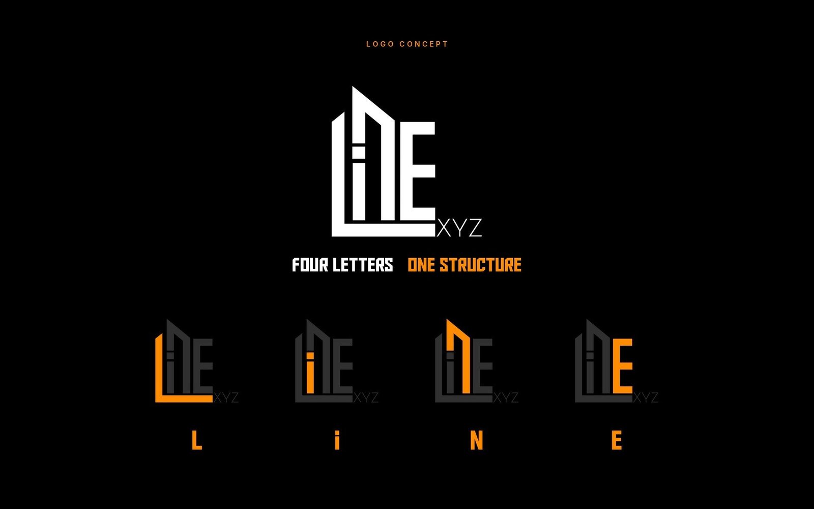
Four letters, one structure
The letters L, i, N and E stand side by side and rise into the outline of a building. The N leans like a roof, the dot of the i becomes a window.
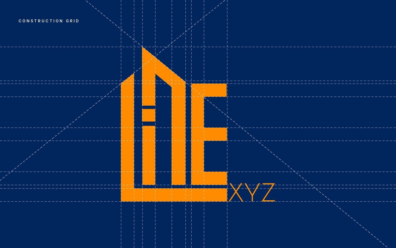
Drawn on a grid
Every stroke and angle sits on a construction grid, like a technical drawing.
Room to stand
Clear space equal to the width of the L stroke keeps the mark solid wherever it goes.

Visual system
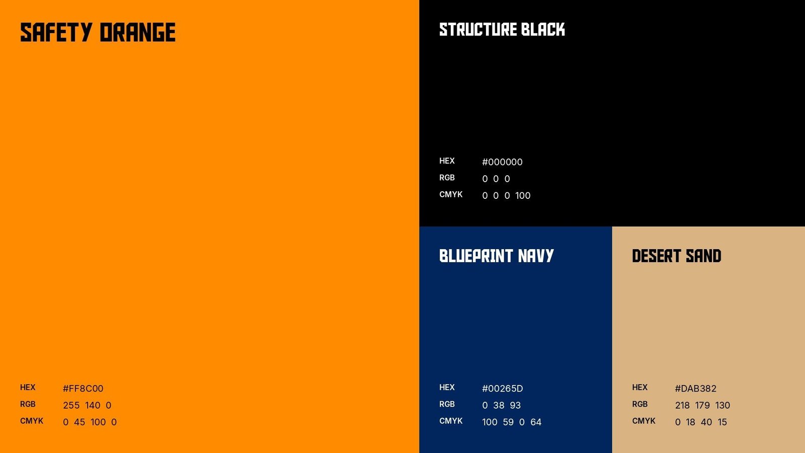
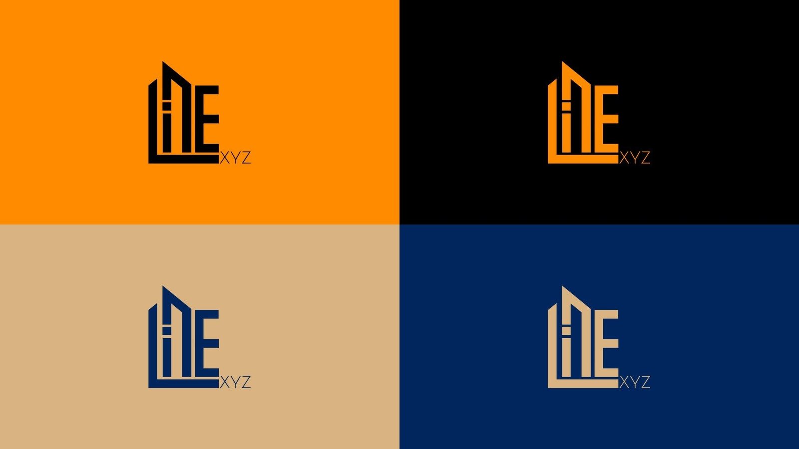
Safety Orange #FF8C00 from the building site, Structure Black #000000, Blueprint Navy #00265D and Desert Sand #DAB382.
Aldo the Apache for Latin headlines; Hacen Extender and Hacen Saudi Arabia XL for Arabic.


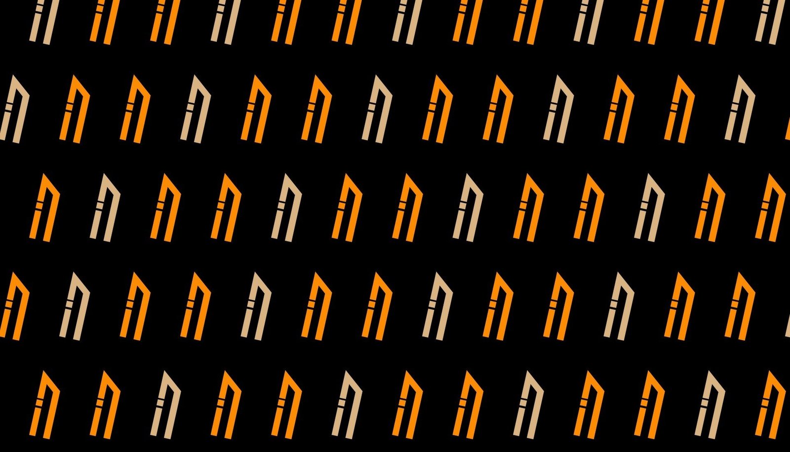
The N and i, cut from the logo, repeat into a pattern and work as a graphic on their own. The line is “Built line by line”.
Applications
Signage, business cards, letterhead, billboards, street posters, hard hats, safety vests, vehicles, tote bags and mugs.
Gallery
Have a project like this?
Let's work together